The Logo Men
A few months ago, I stumbled across an interesting Facebook Fan page called The Logo Men. They are comprised of Pinoy graphic designers who create logo designs for businesses, brands, and websites at a very very affordable rate (you will be surprised). They offer 5 kinds of packages - Hero Pack; Superhero Pack; Character Logo; Themed Logo Design and Logo Repair. They offered to provide me a Hero Pack for Boy-Kuripot in exchange for a feature.The Hero Pack costs P1,950. This includes 3 unique logo concepts/studies and 4 revisions until you are completely satisfied. Check out the complete pricing for all design packages
Ordering the Hero Pack was easy enough. I logged into logodesign.ph website and clicked on the order button found on the services page. It then brought me to the registration page for access to the website. After that, I was brought to the order information page where I needed to fill up a slightly lengthy form about the look and feel of my logo design so they could properly create a design I wanted. It probably took me a good 15 minutes to fill-up that form.
Once the order information page has been processed, I was brought to the PayPal payment portal. I found this very advantageous because it is fast, secure and payment is easy. If you don't know how PayPal system works, don't be scared. All you need is a VISA, MASTERCARD or AMERICAN EXPRESS credit card to register for an account. If you haven't created a PayPal account yet, you should do it now. You will most likely use it in the future.
But if you really don't want to set-up a PayPal account, you may also deposit your payment through BPI or UCPB. Just close the PayPal window and email Contact@thelogomen.com or send them a YM at thelogomen@yahoo.com (they are usually online) to coordinate with the payment
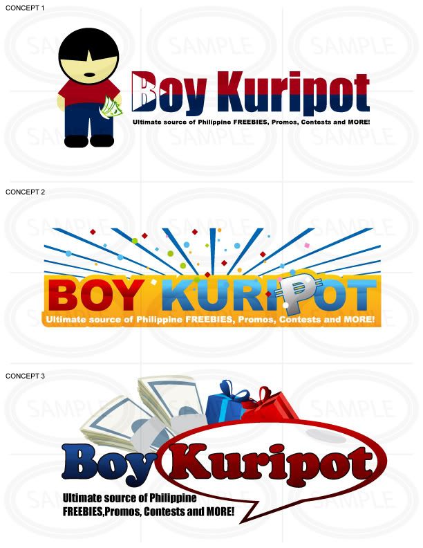
5 working days passed and I was sent my initial concepts which was viewable on the thelogodesign.ph website. This was my feedback:
I sort of like the 1st logo except for the mascot. The mascot looks fat and has an awful hairdo. The 2nd logo has too much colors and design. I remember writing that I want an elegant and simple design. I like the 3rd design but it reminds me of a logo of one of my competitors. I think it can do without the cash and gifts as a background. Try to remove the cash and gifts on the 3rd logo and let's see. Remember, try to make the logos simpler. We are aiming for elegance and style.
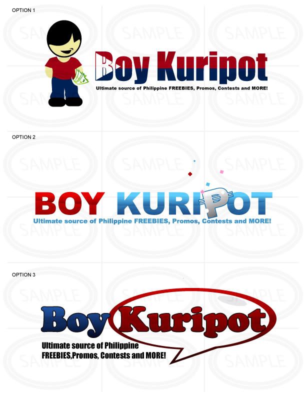
 After another 5 working days, I got these revisions. I liked both option 1 and 3. Option 1 had a cute mascot and the shape and colors of the Philippine flag was incorporated into the text itself. Option 3 had a huge font size and a great choice of font type which was easy on the eyes. I also liked the fact that the word Kuripot was inside a speech bubble that sort of connotes someone calling out Kuripot. I finally made up my mind by choosing option 3. My only request that they make the font of the caption a little bit smaller to make it more legible.
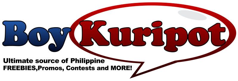
 And here is the final output.
I also requested the logo to be placed on a black background to see if it works well in black as it does on white. Below is a black and white rendition.
To complete the process, they sent me a final file that contained my logo in JPG, GIF, PNG, AI, EPS, TIFF, PSD format. I was very satisfied with their service.
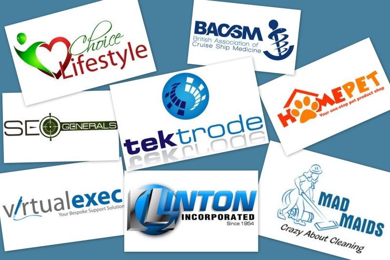
Below are some of the logos they have already done.

For more information on the The Logo Men, you may check out their website thelogodesign.ph, their Facebook Fan page, by email Contact@thelogomen.com or YM thelogomen@yahoo.com


